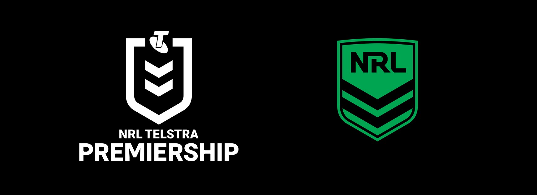
The NRL is set to launch a bold new look for the Telstra Premiership in 2019 and to complement the new design direction we are today introducing a refreshed design for the NRL.com website, the Telstra NRL App and all of our social media.
The new look aims to modernise the Telstra Premiership brand and will be unveiled formally when the NRL Telstra Premiership 2019 draw is announced later this week.
The change to the brand follows an extensive research and consultation process which began in 2017 and included extensive focus groups with key stakeholders including fans, clubs, partners and media.
The refreshed simple and modern design maintains the shield and the chevron - which have both been synonymous with rugby league since the game's inception – but will be far more adaptive to digital environments.
"Whilst the Telstra Premiership competition is undoubtedly one of Australia's most exciting and entertaining experiences for fans, we need to ensure our brand evolves with this changing landscape", the NRL's General Manager of Brand and Marketing Peter Jarmain said.
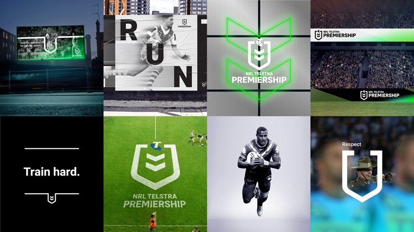
"It was important that we keep the shield and the chevron, which have such historical significance for the code. But the aim was to modernise those very important symbols.
"The new design is more youthful and contemporary, to help the game connect to a younger fan base. But it also allows us to be integrated seamlessly with the 16 club brands, where the true point of connection lies for fans."
South Sydney Rabbitohs CEO Blake Solly said the clubs supported the new brand, particularly the strong integration with the Club network.
"One of the key benefits of the refreshed design system is the ability for the brand to be more closely integrated with the club brands," Solly said. "This is a change in direction and a welcome one."
NRL Digital Update
The NRL has also given nrl.com and the Telstra NRL App a refreshed look to compliment the modernisation of the NRL and Telstra Premiership branding.
A new colour scheme for the website and the NRL App (note - if you're reading this on the App and haven't noticed anything different, check your App store for the latest update).
The new palette is designed to let the full colour and branding of the clubs and all the different competitions we cover take centre stage, with our neutral "magic green" providing the product accents and highlights.
The NRL shield design has also been refreshed and simplified, so that it renders on digital screens of all sizes from smart watches to stadium scoreboards.
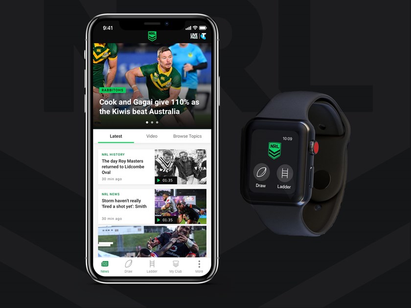
In addition, we are introducing a new set of fonts across the network. Our custom-made NRL font is designed to be more impactful and easier to read on smaller mobile screens. It also makes it much easier to scan data, including the new full player and team stats tables now available on NRL.com.
For the body of articles we are moving to a new serif font, which helps make longer form content more comfortable to read (currently available on web and in the Android app, with iOS to follow soon).
With all of these changes, our design team has been working to ensure we continue to improve the overall level of accessibility for the visually impaired across all our products.
Facebook, Instagram and Twitter
Finally, to complete the design refresh, all of our social channels have been given an update to match the new digital design. Be sure to check out Facebook, Instagram and Snapchat and make sure you are following us on all the platforms you use to get the latest news and best of NRL in your feed.
